Adding depth to a straightforward newsletter
This story stretches back to my full-time job handling writing and communications at the Duke Cancer Center in the Duke Medical Center fund-raising/development office.
I still share it years later because I learned an important lesson in this job: It can be tempting to tear up existing assets (publications, campaigns, etc) and start from scratch to put your spin on them, especially in a new job, but sometimes the best option is tweaking and improving instead of reinventing.
When I arrived, the Cancer Center already had a tabloid-size, two-color newsletter with a simple, clean design.
The format was fine; they did not need an expensive, full-blown magazine. But the newsletter mostly contained short news items, as well as what some refer to as 'grip and grin' photos – i.e., pictures of organization leaders holding over-size images of checks and shaking the hands of donors.
Change management
I thought those pages could promote the Cancer Center's work in a more compelling way. I began looking for longer feature stories to add in with the fund-raising new, and brainstormed ideas for a column or photo feature to go on the back page of each newsletter.
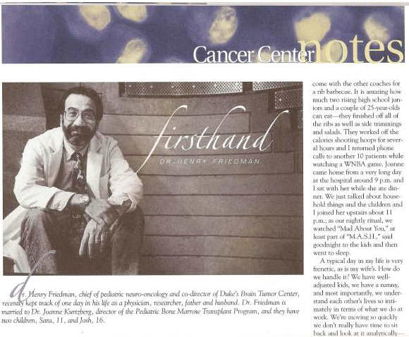
On the front page and inside, I wrote about the work of Duke cancer researchers and patients' lives beyond their cancer treatment. For the back page spot, I came up with a column called "Firsthand," in which individuals – staff, patients, volunteers – would share a day in their lives at the Cancer Center.
Making it personal
The inaugural "Firsthand" column was written by Dr. Henry Friedman, a gregarious neuro-oncologist at the brain tumor center, who shared how he balanced his work with his family life (he is married to another renowned Duke physician, Joanne Kurtzberg). This was the addition I liked the most – not because the stories were always wildly dramatic, but because it gave the Cancer Center a very personal face and highlighted individuals at all levels of cancer care.
I've worked on magazines and publications that were far slicker and more impressive in the big picture, but I was pleased to be able to change this straightforward newsletter into a vehicle for sharing the Cancer Center's many good stories.
